| Is there a new kit, or are we making do with the old one? 00:11 - Aug 20 with 18865 views | VancouverHoop |
Wouldn't be a bad idea. The mint-green change kit can go to the Sally-Ann though. |  | | |  |
| Is there a new kit, or are we making do with the old one? on 14:22 - Aug 20 with 2190 views | Nov77 |
Ccrrrrraaappppppp!
Home kit shouldn’t have any red on it, or any other colour apart from blue and white.
Looks like they designed it from the waist up and gave up when they got to the chest.
Once again some designer’s ego thinks he has to come up with something original and new rather than a classic design. |  |
|  |
| Is there a new kit, or are we making do with the old one? on 14:23 - Aug 20 with 2189 views | daveB |
| Is there a new kit, or are we making do with the old one? on 14:08 - Aug 20 by Gloucs_R |
Home reminds me of the influence kit

Away looks identical to Forest
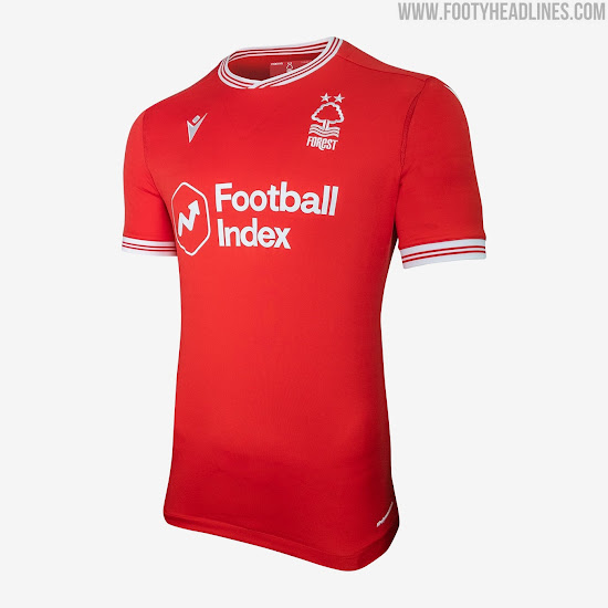 |
apart from the collar and the sleeves they are identical.
I imagine our away kit looks pretty much the same as any red kit |  | |  |
| Is there a new kit, or are we making do with the old one? on 14:26 - Aug 20 with 2166 views | BklynRanger |
Hmmmmmmmmm. Bit barren in the upper area - if we buy anyone of pale complexion he'll look like he's wearing an off the shoulder number.
Sometimes they look better in real life... |  | |  |
| Is there a new kit, or are we making do with the old one? on 14:27 - Aug 20 with 2157 views | daveB |
| Is there a new kit, or are we making do with the old one? on 14:22 - Aug 20 by Nov77 |
Ccrrrrraaappppppp!
Home kit shouldn’t have any red on it, or any other colour apart from blue and white.
Looks like they designed it from the waist up and gave up when they got to the chest.
Once again some designer’s ego thinks he has to come up with something original and new rather than a classic design. |
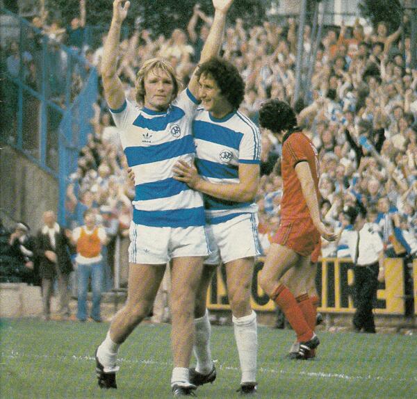
I always like a bit of red, those ones with the red trims are always a hit with me,, looks similar to this classic to me.
the top sort of hoop on this years one is similar to the Warnock season
 |  | |  |
| Is there a new kit, or are we making do with the old one? on 14:28 - Aug 20 with 2147 views | slmrstid |
I don't think anything will ever be worse than the monstrosity that was the 2002/03 home shirt was! |  | |  |
| Is there a new kit, or are we making do with the old one? on 14:28 - Aug 20 with 2147 views | Noelmc |
Interesting that BOS, Manning and Eze were not used as models for the kits, which probably indicates the Club doesn't expect them to be around much longer. |  | |  |
| Is there a new kit, or are we making do with the old one? on 14:32 - Aug 20 with 2125 views | E17hoop |
Too much white on the sleeves for me but they've got to add the EFL badges so they may look better. The red trim should be reflected in the hoops to tie it in. I prefer a slightly darker shade of blue. The trim on both kits - home and away - is aping the Adidas trim from the 80s and works much better on the away shirt than the home.
Will I buy the home one? Not at full price.
Will I buy the away one? Probably.
Home 5/10
Away 8/10 |  |
|  |
| Is there a new kit, or are we making do with the old one? on 14:33 - Aug 20 with 2114 views | Nov77 |
| Is there a new kit, or are we making do with the old one? on 14:27 - Aug 20 by daveB |
I always like a bit of red, those ones with the red trims are always a hit with me,, looks similar to this classic to me.
the top sort of hoop on this years one is similar to the Warnock season
 |
That to me is the all time perfect shirt, so why not recreate it exactly? Why does it have to be tweaked? With bits missing or extra colours added? |  |
|  |
Login to get fewer ads
| Is there a new kit, or are we making do with the old one? on 14:34 - Aug 20 with 2111 views | francisbowles |
I like the home kit 7
I don't like the away reminds me of Forest as well or even worse Man Ure 2
I quite liked the Tiffany blue and even the pink grew on me. However, I am a real all kits should be hoops in almost any colour combination. |  | |  |
| Is there a new kit, or are we making do with the old one? on 14:39 - Aug 20 with 2079 views | BrianMcCarthy |
| Is there a new kit, or are we making do with the old one? on 14:28 - Aug 20 by Noelmc |
Interesting that BOS, Manning and Eze were not used as models for the kits, which probably indicates the Club doesn't expect them to be around much longer. |
Very good spot, Noel!
Or at least they're not sure. |  |
|  |
| Is there a new kit, or are we making do with the old one? on 14:39 - Aug 20 with 2078 views | Lblock |
I love it.
It’s great.
Doesn’t look cheap at all.
Well done |  |
| Cherish and enjoy life.... this ain't no dress rehearsal |
|  |
| Is there a new kit, or are we making do with the old one? on 14:53 - Aug 20 with 1991 views | A40Bosh |
most years I am like "whatever, it's grand"
This year I have to say, not a fan at all.
I think the shot of Barbet highlights that there is too much white on the shoulders and arms and not blue to balance it only the red trim - that should have at least been blue.
We are Blue and White Hoops
This is White and Blue
Doesn't work for me 4/10 |  |
|  |
| Is there a new kit, or are we making do with the old one? on 15:07 - Aug 20 with 1945 views | Hunterhoop |
| Is there a new kit, or are we making do with the old one? on 14:18 - Aug 20 by daveB |
Calm Down, i've not said your view isn't valid, just thought it was a bit over the top to say it was awful. Is pretty similar to the Adidas kit from the late 70's which I liked as well. |
I’m very calm. Genuinely very calm. Quite sleepy if I’m honest.
The Adidas has the blue hoop much higher almost at the neck, which made the hoop ending at the shoulders look normal. It then had blue stripes across the top of the white shoulders and down the white sleeves. Thought that looked a lot more professional and in line with the Adidas brand.
This kit just has so much white. Looks like 3 blue stripes stuck on horizontally 1/3 the way down the top. Looks like a template design where you select the colours. Just don’t like it. |  | |  |
| Is there a new kit, or are we making do with the old one? on 15:15 - Aug 20 with 1909 views | Hunterhoop |
The KLM kit has much thicker hoops which again means the blue stretches higher towards the shoulders preventing the great expense of white. It also has the hoop continue onto the sleeve if you stand with your arms outstretched by your side, so blue on the sleeve too.
I genuinely don’t get how anyone can think this kit looks like the Adidas kit or KLM one. The hoops are in different places, the sleeves have blue on. The KLM one has a different shade of blue and thicker hoops too. The Adidas kit had the badge on the white hoop, not blue like usual, precisely because the blue hoop was so high.
If they stuck some blue running along the shoulders down the sleeves, it would have made such a difference...or let the hoop continue onto the sleeve. |  | |  |
| Is there a new kit, or are we making do with the old one? on 15:26 - Aug 20 with 1873 views | CamberleyR |
| Is there a new kit, or are we making do with the old one? on 14:22 - Aug 20 by Nov77 |
Ccrrrrraaappppppp!
Home kit shouldn’t have any red on it, or any other colour apart from blue and white.
Looks like they designed it from the waist up and gave up when they got to the chest.
Once again some designer’s ego thinks he has to come up with something original and new rather than a classic design. |
"Looks like they designed it from the waist up and gave up when they got to the chest."
Exactly my thoughts on first seeing it. Too much white. If it had some blue across the shoulders it would be better. |  |
|  |
| Is there a new kit, or are we making do with the old one? on 15:32 - Aug 20 with 1845 views | joe90 |
We've been lucky the past few season with sponsors as we've managed to avoid garish logo's.
I don't mind these new kits. The home has a retro feel, which I like.
Hopefully we'll have red numbers/names on the back. I've always thought the kit should essentially be a white shirt with three blue hoops as apposed to Reading who tend to have more blue than white.
Kakay wears it well in the promo photo's. Sadly most of the people buying it won't have his physique! |  | |  |
| Is there a new kit, or are we making do with the old one? on 15:32 - Aug 20 with 1845 views | Northernr |
I think they're ok. Hot take.
Away kit is a vast improvement on some of the sht we've walked out in over the past five or six years. |  | |  |
| Is there a new kit, or are we making do with the old one? on 15:34 - Aug 20 with 1838 views | daveB |
| Is there a new kit, or are we making do with the old one? on 15:07 - Aug 20 by Hunterhoop |
I’m very calm. Genuinely very calm. Quite sleepy if I’m honest.
The Adidas has the blue hoop much higher almost at the neck, which made the hoop ending at the shoulders look normal. It then had blue stripes across the top of the white shoulders and down the white sleeves. Thought that looked a lot more professional and in line with the Adidas brand.
This kit just has so much white. Looks like 3 blue stripes stuck on horizontally 1/3 the way down the top. Looks like a template design where you select the colours. Just don’t like it. |
Get the sleeves are different but the hoops look pretty similar to me on the Adidas one, the Warnock season had a similar style as well. |  | |  |
| Is there a new kit, or are we making do with the old one? on 15:37 - Aug 20 with 1827 views | Antti_Heinola |
| Is there a new kit, or are we making do with the old one? on 14:22 - Aug 20 by Nov77 |
Ccrrrrraaappppppp!
Home kit shouldn’t have any red on it, or any other colour apart from blue and white.
Looks like they designed it from the waist up and gave up when they got to the chest.
Once again some designer’s ego thinks he has to come up with something original and new rather than a classic design. |
I think some of our best kits have red in them. I think it's universally agreed the Addidas / Guinness kit with the red piping is one of, if not our best, kit ever.
Most fans think that, so can hardly blame the club for it. I think it gives it a smart edge personally.
Take your point, but even your avi has a red number ;) |  |
|  |
| Is there a new kit, or are we making do with the old one? on 15:40 - Aug 20 with 1808 views | queensparker |
I really liked the pink one, so I'm not sure I'm qualified to comment |  | |  |
| Is there a new kit, or are we making do with the old one? on 15:41 - Aug 20 with 1799 views | DWQPR |
Now given that this was recently voted the best QPR kit of all time I can see a very striking similarity between the Guinness kit and the new kit.

Plenty of red in this one, but of course the Adidas shirt has the three stripes running down the sleeve breaking up the white of the shoulders. The first hoop as one poster put it is a horizontal stripe (not to me it isn't).
As for the away shirt, we haven't always done all red tops but have a history of them dating back to the early 70's well before the Dennis the Menace shirt was ever thought about. We had this, which was a favourite of mine

This, short-lived effort from Admiral (half a of the 1974-75 season before the club switched to Umbro because of quality issues)

I remember my brother getting that one for his birthday. And of course the most fabled of the all red shirts was the Cup Final one

And all came with black shorts and socks. For me I like the home shirt, plain and simple and when compared to the way Nike or Adidas produce kits for clubs I like the fact that Errea allow free reign on design. A decent 8.5/10 for both kits. |  |
|  |
| Is there a new kit, or are we making do with the old one? on 15:48 - Aug 20 with 1778 views | Antti_Heinola |
I love these threads every year.
The fashionistas of Milan and Paris would be in awe at the intricacies of our rows involving size, shape, placement, shade and piping of hoops.
Everyone forgets about it once we've lost our first three and are 'sleepwalking towards relegation'. |  |
|  |
| Is there a new kit, or are we making do with the old one? on 15:53 - Aug 20 with 1751 views | BrianMcCarthy |
Good posts by Antti and DW.
Both are right when they say that the designers can hardly be blamed for, say, having red trim when our favourite ever shirts have red trim.
We're rightly precious about our beloved hoops but the designers can't please everyone. Even our favourite shirts are not universally loved.
I still like the home shirt. I'd like more blue on the sleeves, but it's got everything else right. It's a quality shirt and everyone I've sent it to today has rated it as nice, damn nice or gorgeous. Me, I'm sticking with 7.5.
As for the away kit - that's just kit porn. |  |
|  |
| Is there a new kit, or are we making do with the old one? on 15:55 - Aug 20 with 1742 views | cpgerber |
What I like about the away kit, is that we'll have to play in our home strip more often. Never been a fan of a dedicated away strip or worse, a 3rd kit... which we'll probably introduce for games away at Boro, Barnsley, Forest Rotherham and Bristol City. Maybe Stoke & Brentford as well. But I hope we play with the hoops away in those games. |  | |  |
| Is there a new kit, or are we making do with the old one? on 15:56 - Aug 20 with 1737 views | bosh67 |
To be honest I wasn't a huge fan of the polo top last season but I sort of grew to really like it. I suspect people will grow to like this one too.
The away kit makes me smile because it is virtually identical to the 1982 kit that took us to the FA Cup final and for people of my age that really is a nice throwback kit.
The only thing that also made me smile was the 4 stripe piping. Reminded me of being at school and not being able to afford Adidas trainers. I lived in a bit of a poor area where we had 2 or 4 stripes on our trainers.
As long as it's got blue and white hoops it's a bit of a meh thing for me. My only other comment is that the kit manufacturer does seem to put a bit more thought into the training gear than the actual kit.
Perhaps one year they should just go with Laura Ashley floral patterns and see what the fans think? |  |
|  |
| |